Saturday, 27 July 2013

Ikat Chevron

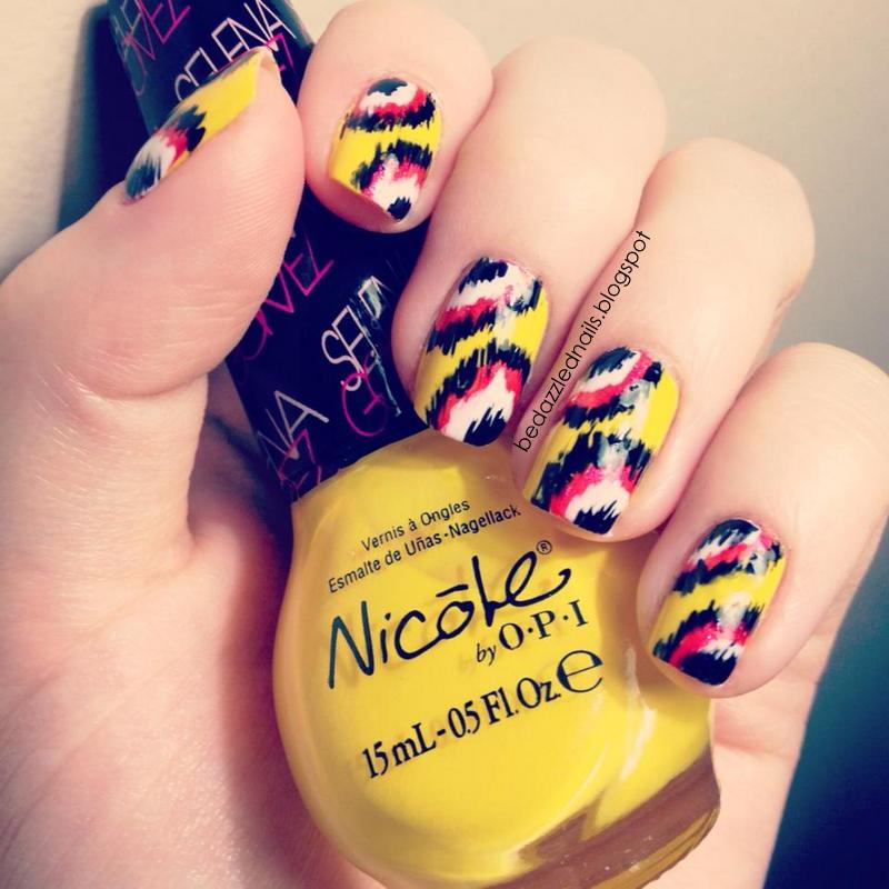
As you can tell from the background on my blog, I'm a HUGE fan of chevron patterns.  I've been wanting to do a chevron design on my nails for a while but I didn't want to take the time to tape off each line.  I knew I wouldn't be happy with the lines if I did it free hand (I'm a bit of a perfectionist when it comes to my nails).  I was watching The Marilyn Dennis Show the other day and they were creating their own Ikat pillows.  Ikat is a fabric dying technique which results in a pattern that looks like the dye has bled through the fabric.  I started looking at Ikat patterns in google and came across my inspiration.
 
I remembered coming across a tutorial on Pinterest.  Concrete and Nail Polish created a great, easy to follow tutorial.

I started with a base of "White On" by Sally Hansen.
 I then used a small polish brush that comes in the Kiss Nail Paint bottles to begin creating my design.  I love the grey and yellow look so I chose "Grey Matter" by Rimmel and "Hit the Lights" by Nicole by OPI.
Here is the final product! I'm so happy with it.
 This design could easily be changed for any season or holiday:

  • pastels for Easter/Spring
  • red, white, and green for Christmas
  • blues and silvers for Winter
The possibilities are endless!  Not just with this design, but Ikat in general.  Here is an Ikat design I did before I started blogging.
Happy Painting!

Love, Kate xo


Saturday, 20 July 2013

Psychedelic Water Marble

It's been quite a while since I've done water marble nails.  The main reason I haven't done it in a while is because it's a little time consuming and messy.  I've been wanting to do one for a while now and finally got the time.  There is a great tutorial by Pack a Punch Polish.  For this design, I used White On by Sally Hansen, Fuchsia by Pupa, Orange by Pupa, Green With Envy by Sally Hansen, and Blue Me Away by Sally Hansen.  
This is one of my favourite colour combinations
 I started with a base of white.  When doing water marble, starting with a white base makes the colours much brighter.
 When choosing my polishes, I tried several different colours.  Some polishes just don't spread out when you drip them into the water.  To increase your success, use filtered water that is at room temperature.  Some people tape around their nails to keep their skin from getting polish all over it but I just find this time consuming.  Nail polish remover and a shower cleans up your fingers just fine.  When it came to dripping my polishes into the water I went "pink, orange, green, blue" 3 times. Here's the final product!
 My ring finger being more orange than blue was a happy accident (an unintentional accent nail).  I am so excited about how these turned out!
 Happy Painting!

Love Kate, xo

Wednesday, 10 July 2013

Feeling Fishy

As promised, here are the 4 new polishes I bought a week ago.  They are from Covergirl's Glosstini collection.  I love them all and I really can't decide which one I like best.
Appletini

Orange Oasis

Pina Colada

Bahama Mama
When it came to a design, I was bound and determined to use all four colours.  For a while, I've been wanting to do a fishtail braid design.  I started with the fishtail design on my ring finger.  I followed the tutorial from The Beauty Department )http://thebeautydepartment.com/2012/07/nailed-it-7/).
Like I said, I was bound and determined to used all 4 colours, but I had yet to use "Bahama Mama".  I decided to continue with the fish theme and add fish scales to my middle finger.
Woohoo, I used all four!  But I felt like my pointer and pinky needed a little attention.  Again with the fish theme, I added a different type of fishtail to those fingers. Here is the final product!!

Happy Painting!

Love, Kate xo

Monday, 1 July 2013

Canada Day Nails

I always enjoy doing theme/holiday nails.  It always presents the added challenge of trying to stay within a theme by using specific colours and/or symbols.  For my Canada Day nails, I did a simple search of "Canada Day" in Google to look for some inspiration.  I saw a lot of flags and fireworks and when I saw pictures of a moose and a beaver I knew I had to put them onto my nails.  I used the following two images for inspiration.
For this design, I used "The Spy Who Loved Me" (red) by O.P.I., "Yellow Ochre" and "Coffee Bean" acrylic paint by Folk Art, "White On" by Sally Hansen, and "Black" and "White" by Kiss.
I started with a red base on all my nails.  I realized after the fact that none of the pictures I took of my base colour were clear so I had to take a picture of my right hand.
 
Here is the final product! I knew I would struggled to create a perfect maple leaf so I substituted a heart so symbolize my love for my country.  However, I wish I had done my flag nail horizontally instead of vertically so you could see more red.  Oh well! It's all about trial and error :)  I used a small paint brush to paint the characters and tape to tape off the white area of my flag.

  
I'd have to say my favourite part of this design is the moose.  He might just have to make another appearance at Christmas time.  Perhaps with a red nose to turn him into a reindeer a.k.a Rudolph.


As much as I like this design, I can't wait to take it off and try some of my new polishes.  I have 4 new summery colours that I'm super excited about. I can guarantee that you will see them in my next post.  Until then...

Happy Painting!

Love, Kate xo


Monday, 24 June 2013

Flirty Florals

Summer is FINALLY here so I just had to do a bright, flowery design in celebration.  For this design I used "Mellow Yellow" by Sally Hansen, "White On" by Sally Hansen, "Bikini Pink" by Kiss, "Neon Orange" by Kiss, "One-Time Lime" by Nicole by OPI, "Blue Me Away" by Sally Hansen, and "Play Date" by Essie.
I started with yellow as my base.
I then used my dotting tool (straight pin stuck into a pencil eraser) and began making different coloured flowers on my nails.  I placed 5 dots in a circle and did an accent colour in the middle of each flower.  I then added white dots to fill in the spaces between the flowers.  Here is the final product!!
These nails make me so happy! They are bright, colourful, and fun.

Happy Painting!

Love, Kate xo
Tuesday, 18 June 2013

Textured Polish from Sally Hansen

I picked up two new polishes yesterday and had to try them both out right away! Sally Hansen has come out with a collection of textured polishes: Sugar Coat and Fuzzy Coat.  I decided to give Sugar Coat a try.  I chose "Bubble Plum" because it is beautiful purple/pink shade.  I also bought a new Xtreme Wear polish from Sally Hansen called "Perfect Pear-ing".  It is a gorgeous shade of green that I am absolutely in love with.
I started with a base coat of "Perfect Pear-ing".  I tried my best to photograph the colour exactly how it is in person but I didn't quite get it.  So you'll have to take my word that it's even more beautiful in person.
 I then used page hole protectors to tape off the bottom "half moon" of each nail.  I cut each circle in half to get them to stick to my nails better.
I then added a layer of Sugar Coat over top of the green.  After letting it dry for 30 seconds or so, I removed the stickers.
I wasn't a big fan of the raw edge that was left behind.  It just felt unfinished.  I decided to add small white dots (Sally Hansen's "White On") along the edge.  I like the Sugar Coat polish because it's a simple way to add interest to your nails with a simple stroke of the brush (easy peasy!).
Overall, I'm really happy with the colour combination and my new polishes.  I just feel like the design is still missing something.  What do you guys think?

Happy Painting!

Love, Kate xo

Sunday, 9 June 2013

New Essie Polish!

I bought 4 new Essie polishes on Friday and just had to use them all at once.  I'm a big fan of the colours that Essie has.  I bought "Turquoise and Caicos", "Play Date", "Cute As a Button", and "Lapiz of Luxury".  I ended up using Sally Hansen's "White On" as an accent.
I started by randomly applying all the colours (mint, purple, coral, blue).
 I then used the brushes that come with the polishes to add curves of colours to the tips of my nails.  I saw this design on the Essie website in "Essie Looks" section (http://www.essie.com/essie-looks.aspx).
I felt like the design needed a little something extra.  I really liked the pop of white that was on the Essie bottles.  I chose to do white dots along the curves of each colour and I am in LOVE with the final product.  I don't know about you guys, but the colours on my pinky nail immediately make me think of the Little Mermaid (Kelsey, you will know what I'm talking about).
Happy Painting!

Love, Kate xo